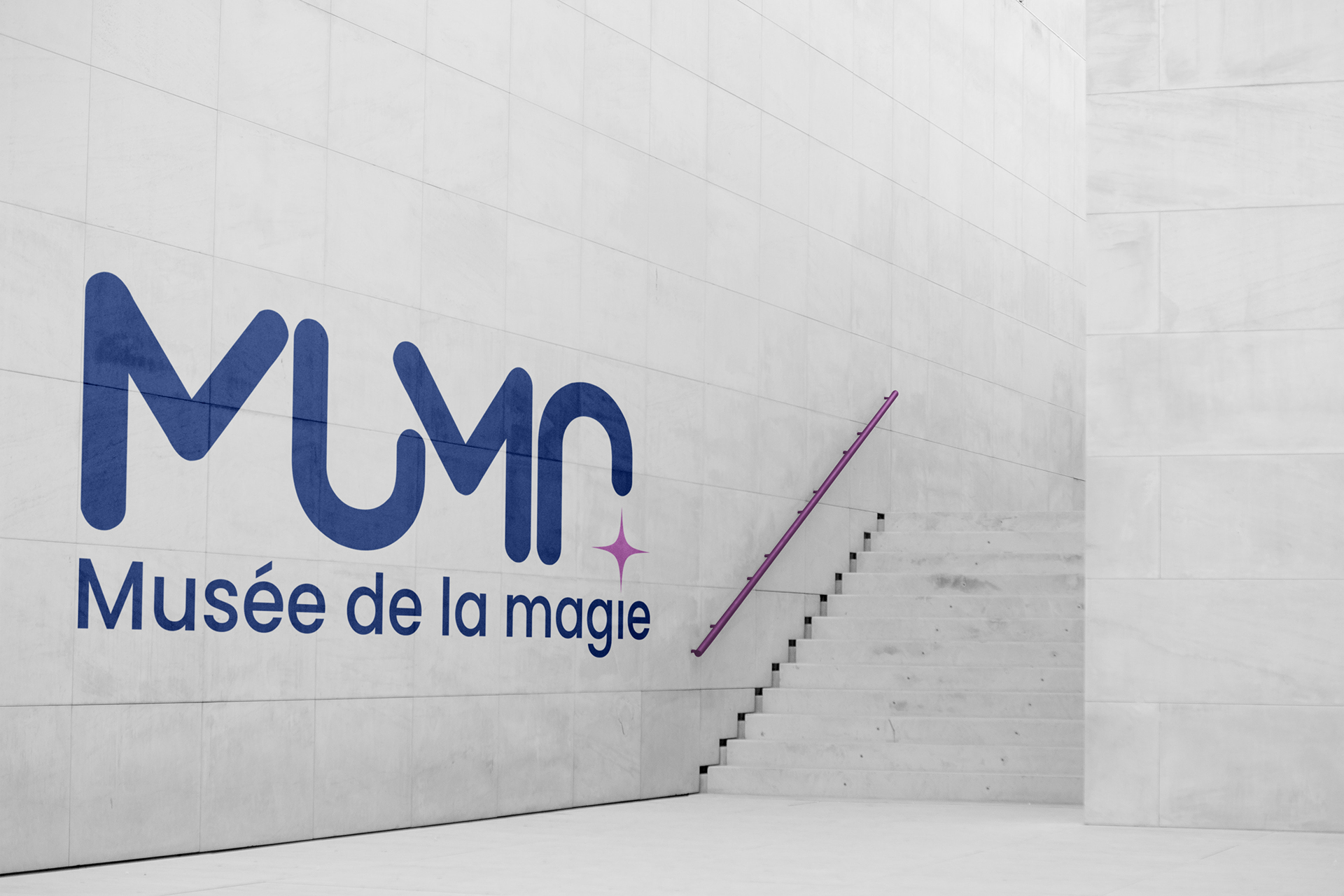
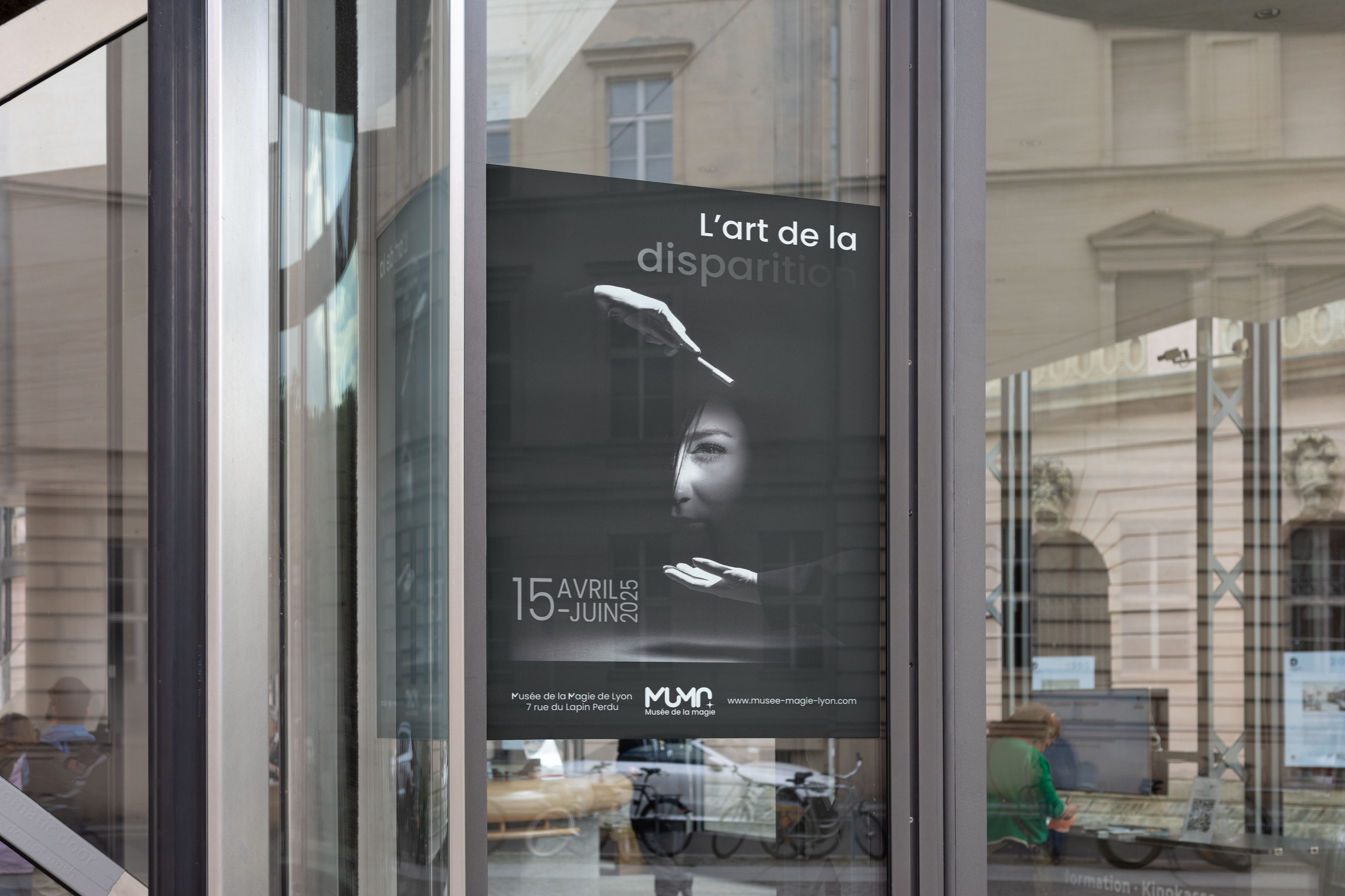
Designing the visual identity for the Museum of Magic in Lyon was about exploring magic as a universal, enchanting flow of energy, beyond conventional clichés.
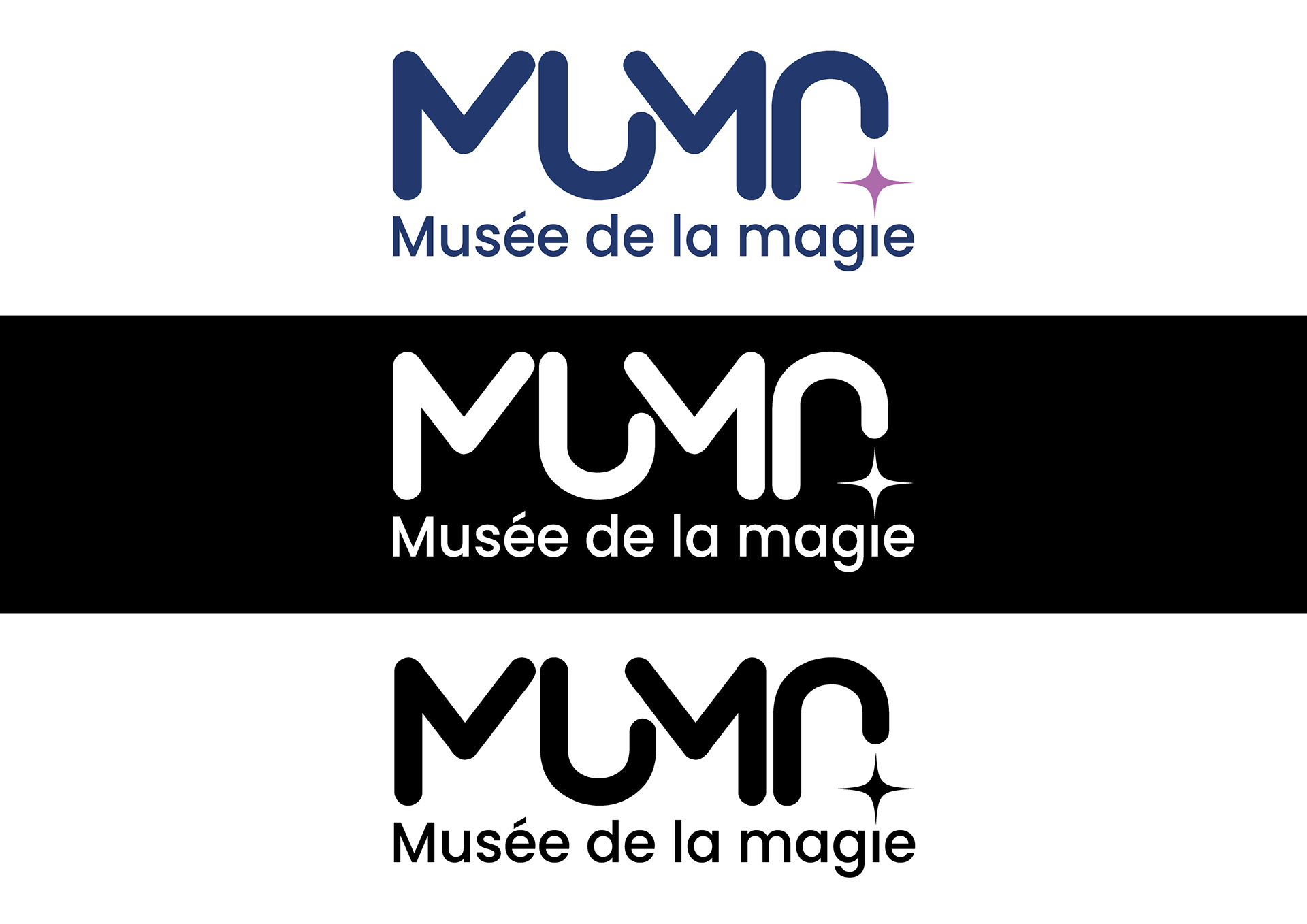
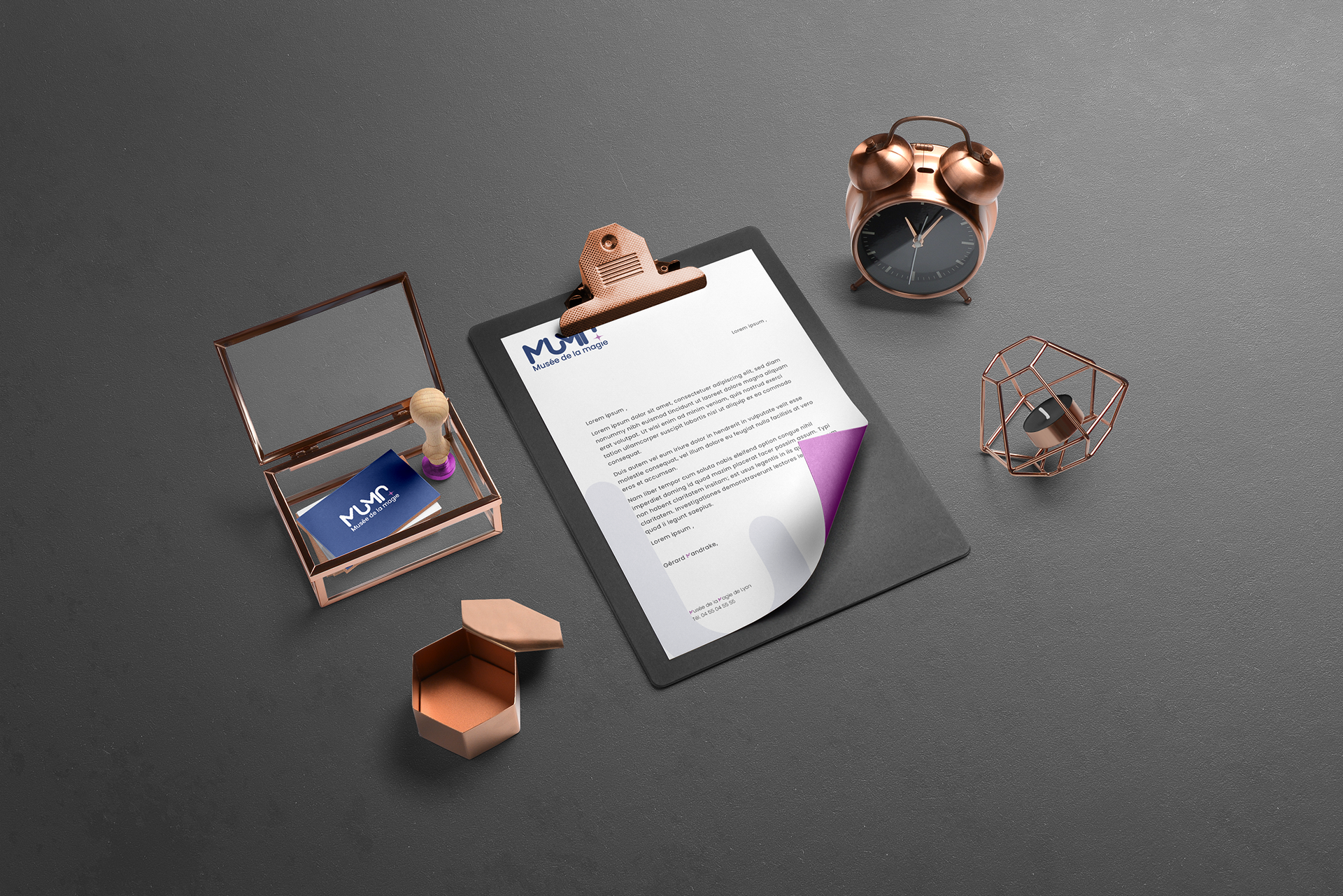
The 'MUMA' logo embodies this flow. Its four uppercase letters are subtly hinted at, partially visible, symbolizing continuity and perpetual motion. A violet star, a discreet echo of the 'i' in 'magie' (magic), adds a touch of mystery. The deep blue and violet palette reinforces this enigmatic atmosphere.
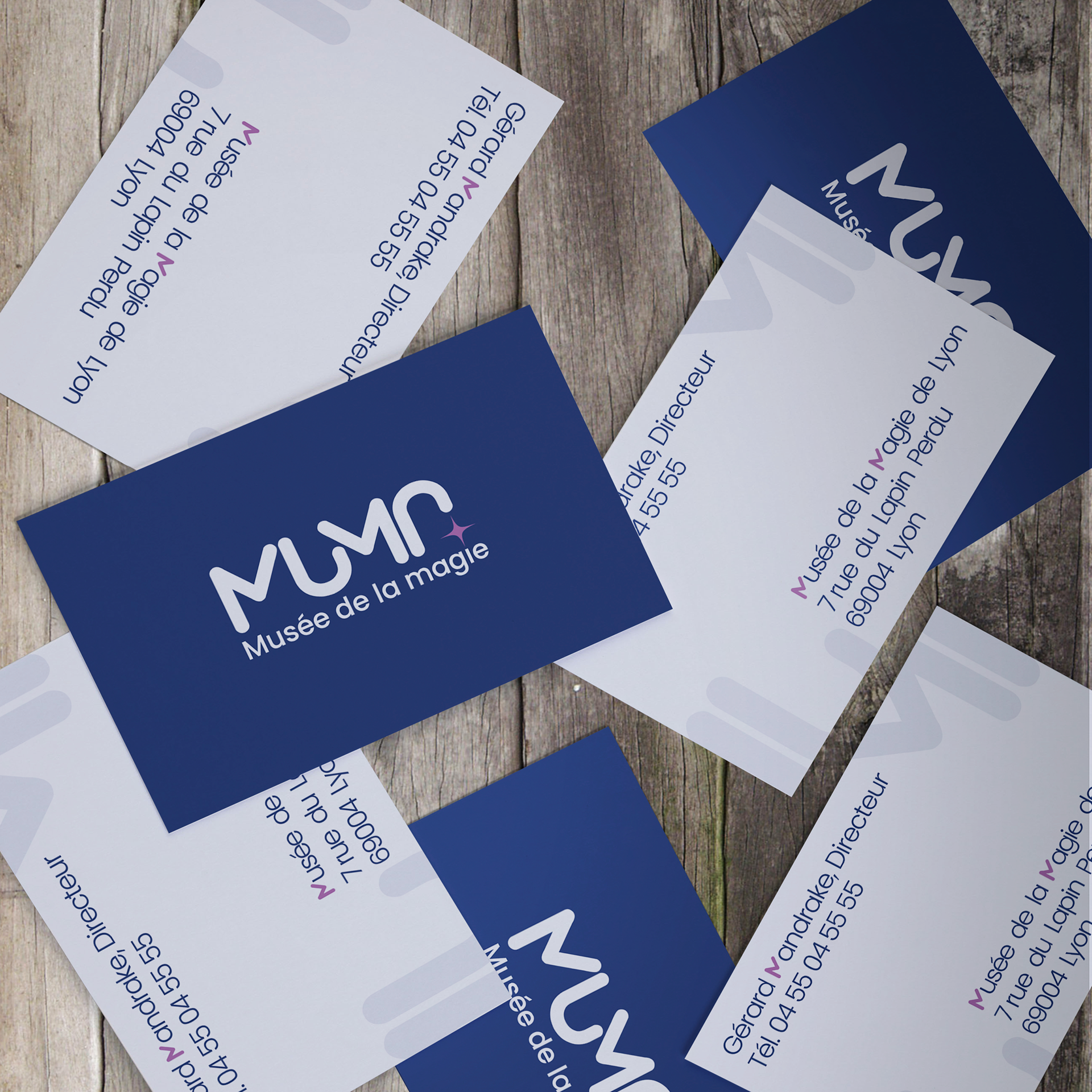
The full museum name, 'Musée de la magie' (Museum of Magic), uses the Poppins typeface, a geometric and modern font ensuring clarity and neutrality. This choice accentuates MUMA's accessibility, much like a museum that preserves and transmits knowledge without prejudice.
This logo translates magic through evocative motion, allowing for personal interpretation. Its black and white version ensures perfect adaptability for all applications.
Thanks for watching