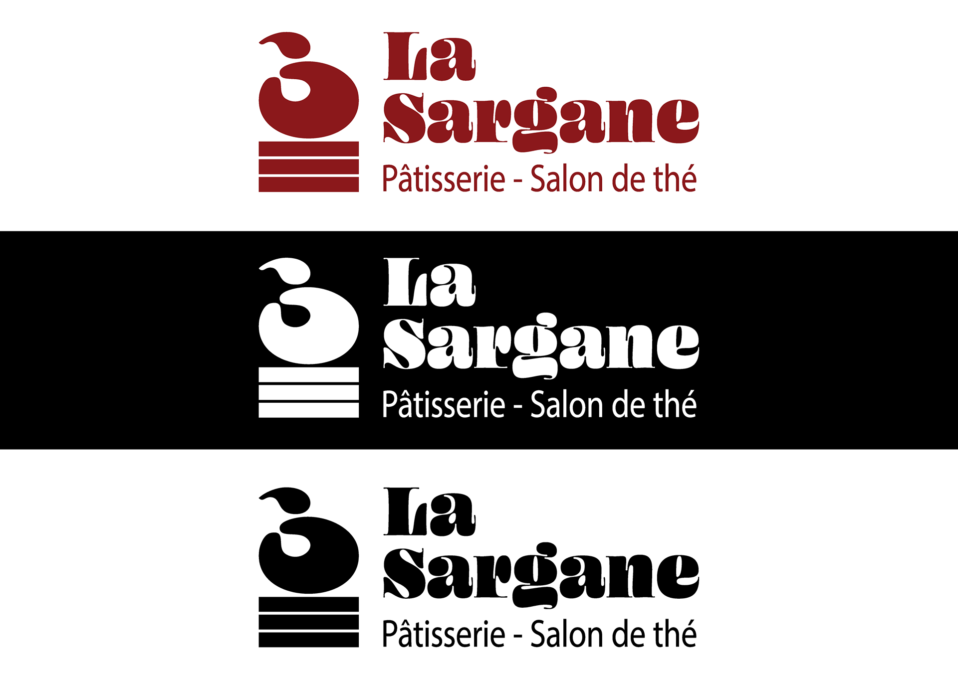
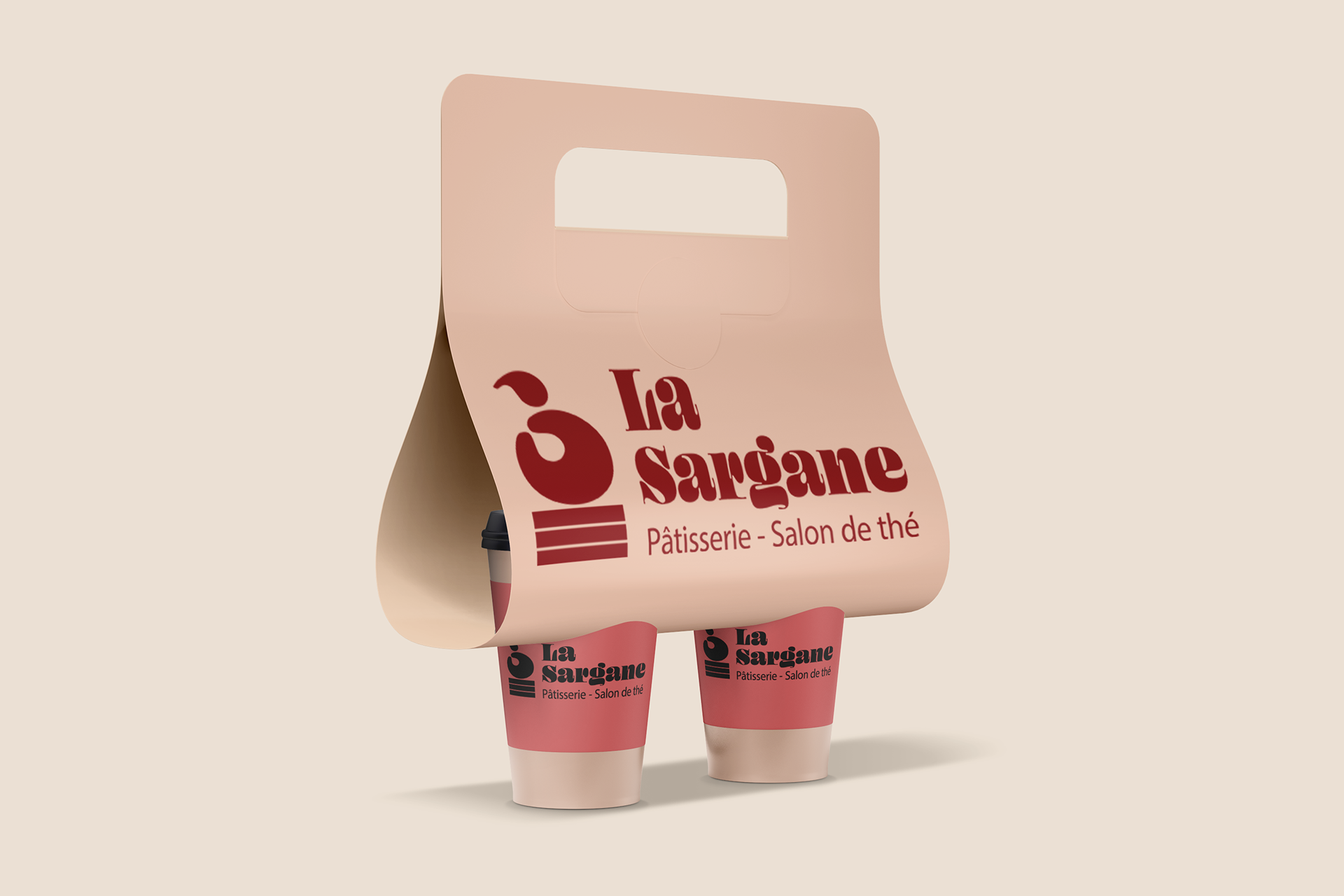
“The cherry on the cake” aimed to create a sophisticated and timeless visual identity for “La Sargane”, aligning with its values of authenticity and quality. A minimalist approach highlights the pastry shop’s refinement and elegance.
The logo features a stylized cherry, symbolizing gourmet delight and pleasure, perched on a “cake” formed by three lines. These lines symbolize “La Sargane’s” three distinct spaces: the pastry shop, the tea room, and the takeaway service.
The simplicity of shapes and purity of lines evoke the elegance and refinement of the pastry shop’s creations. The logo’s cherry red conveys the passion and expertise driving “La Sargane”. This distinctive red is also used for the pastry shop's name, set in the Ohno Blazeface typeface, which is both minimalist and geometric. The “Pâtisserie - Salon de thé” baseline, in Myriad Pro, completes the design with sobriety and readability.
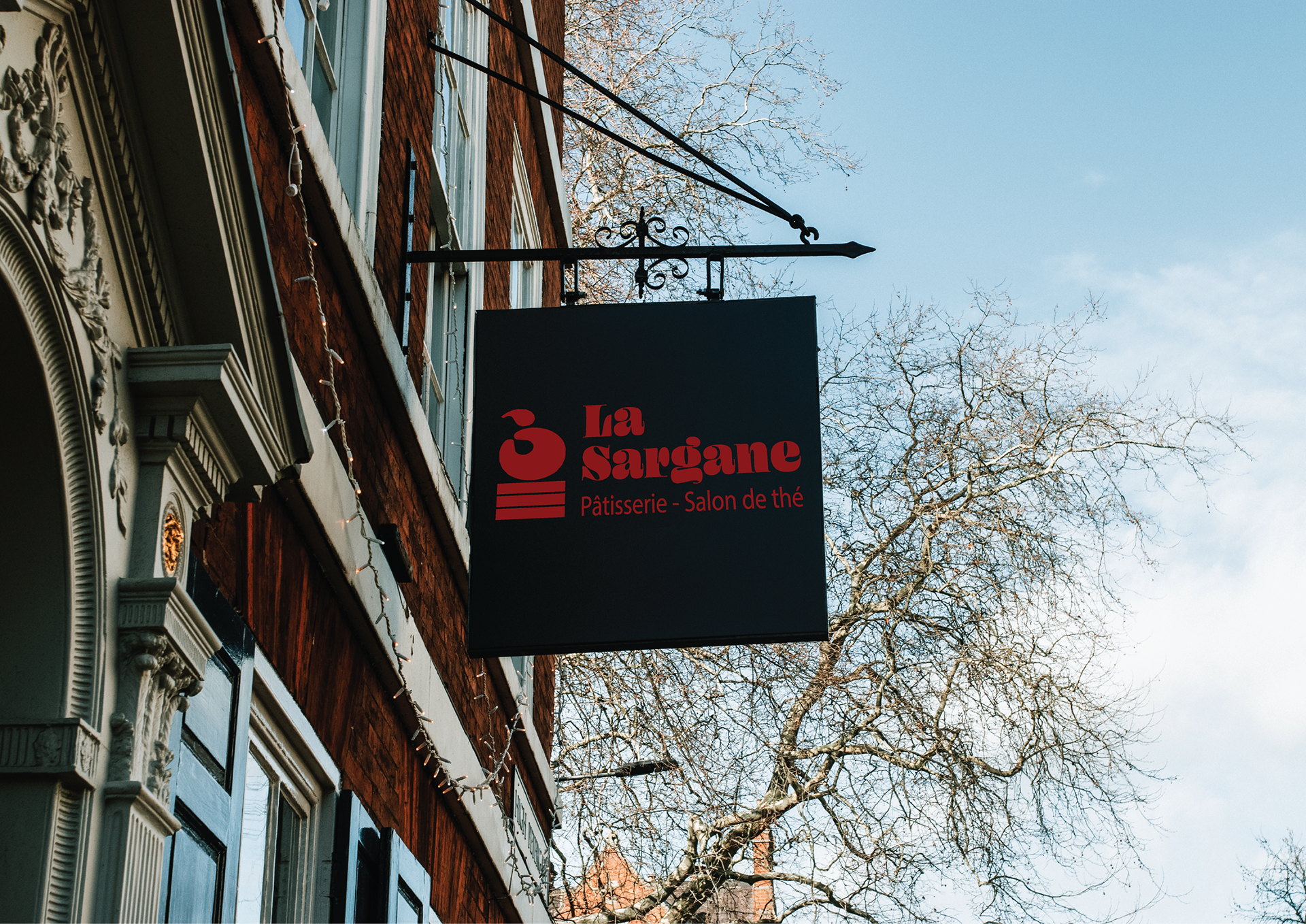
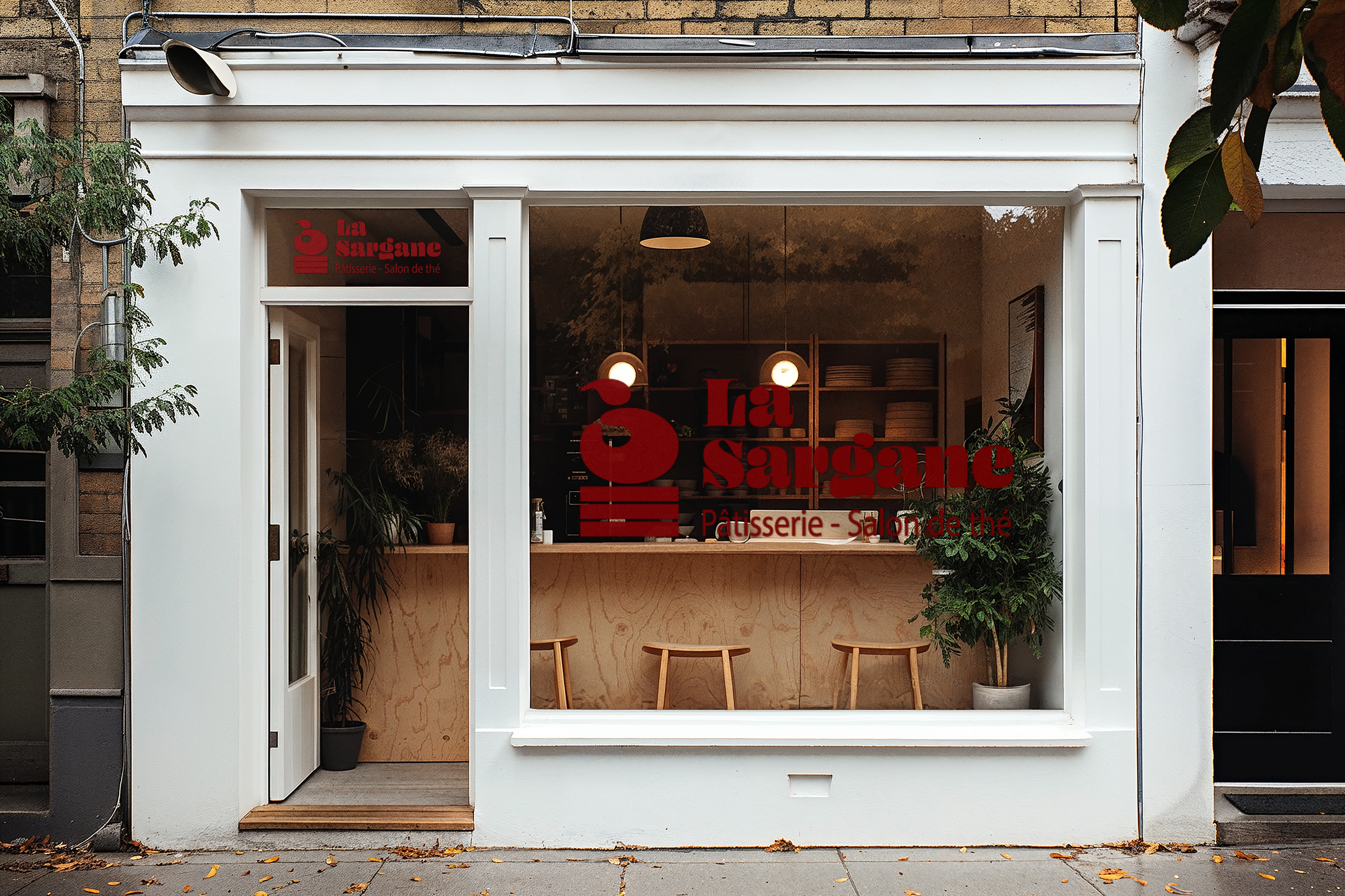
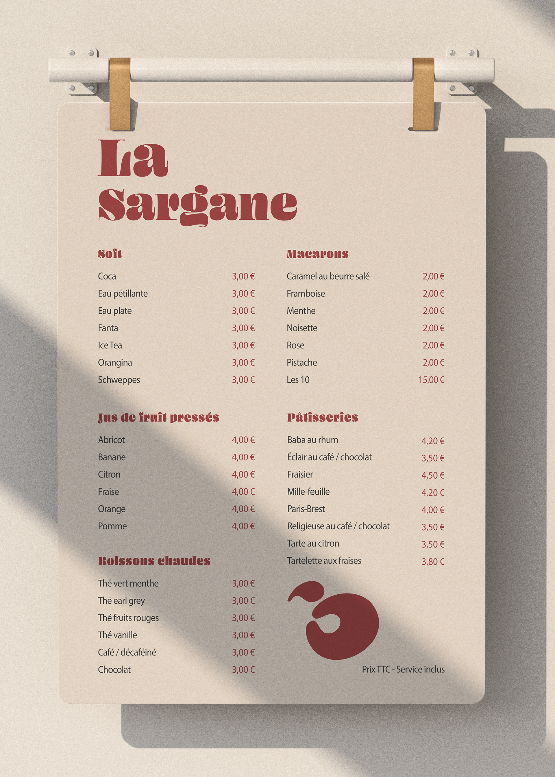
Paired with the menu card, this logo creates a strong, memorable visual identity, attracting customers seeking a unique and refined gourmet experience. The menu card faithfully adopts the logo's visual codes: minimalism, colors, typography, and the cherry.
Thanks for watching